https://www.thephoblographer.com/2021/06/22/how-one-man-is-striving-to-keep-the-look-of-kodachrome-64-alive/
How One Man Is Striving to Keep the Look of Kodachrome 64 Alive
“Trawling through blogs and reviews, it because apparent that digital Kodachrome emulation is highly contentious,” says photographer Freddie Child-Villiers to The Phoblographer in an email interview. Freddie is the man behind the Kodachrome project–an attempt at keeping the look of Kodachrome alive and authentic. “…Some users want an accurate reproduction (Jamie Windsor’s being the best that I’ve tested). Others want a look of imagery one would expect from Magnum Photos or National Geographic pages; this is where The Kodachrome Project leans.” Like many folks, Freddie has done a ton of research on Kodachrome. And his project is truly starting to take off.
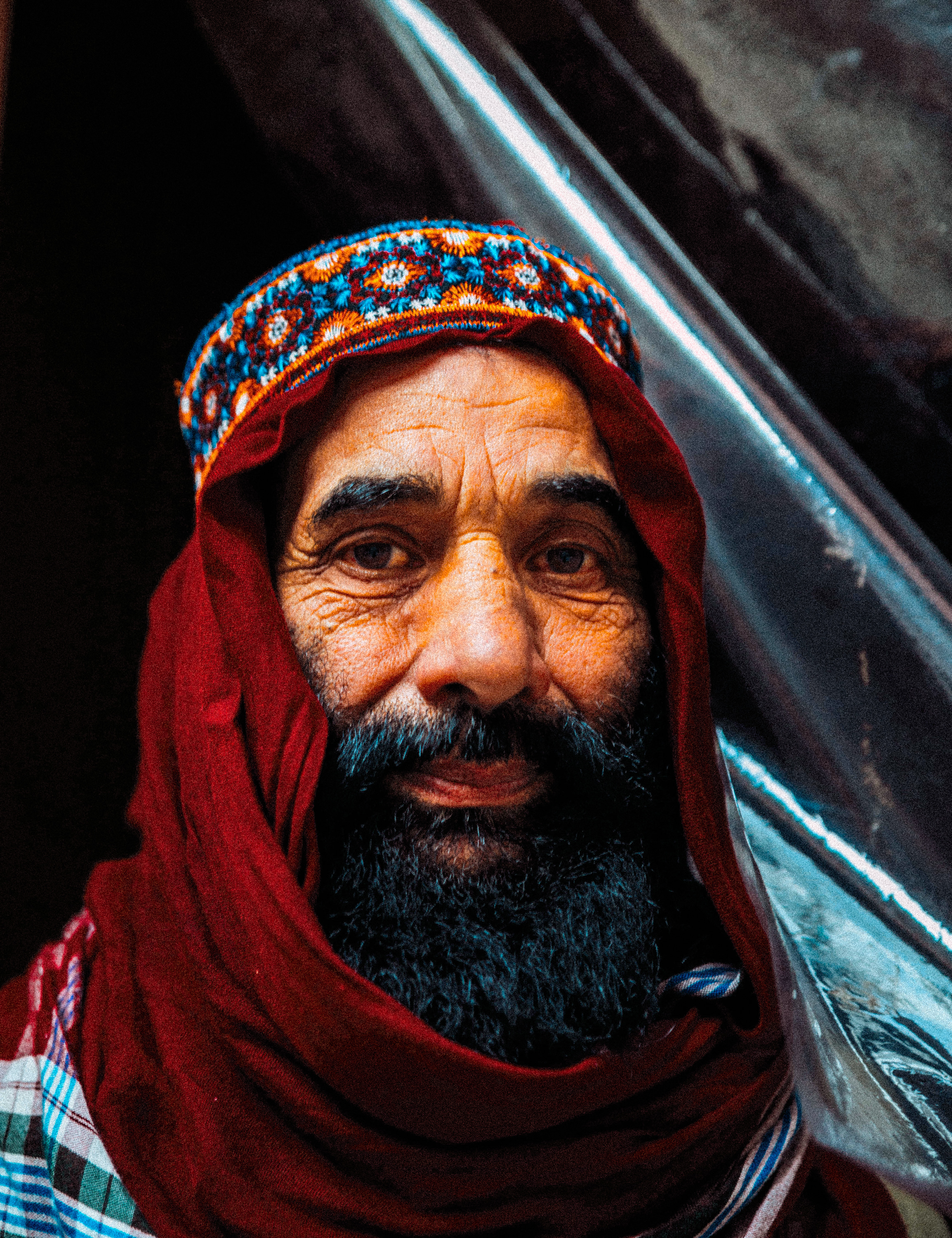
Years ago, I, too, looked into developing my own looks. As you probably know, The Phoblographer is one of the last photoblogs that’s done original reviews of film emulsions. Unlike a bunch who just like to round up content, we believe in trying the product ourselves: it’s more authentic.
So after my years of shooting film, I began studying the looks myself. I’ve also experimented with in-camera profiles to make it easier. In my own studies, I have been working on trying to see if the look of film can really be created via preset. I’ve created lots of images where I’ve shot both film and digital. And I’ve always had my own thoughts on film. First off, I think it was primarily developed without people of color in mind. This is one of the reasons why we need a large silver reflector on people with darker skin tones. I’ve kept most of my research to myself. A few years ago, there was a company very interested in the research, but I turned them down.
Freddie has a similar story, except that he actually executed. He began by looking through tons of slides. Then he matched the tones to similar subjects digitally shot. He analyzed how the film responded to color and really cites Steve McCurry’s work here. What’s unique is that Freddie masked out the colors and tones that affected skin. But he got consistent results with reds, yellows, blues, etc.
Freddie shared more on how he developed the Kodachrome Project.
Phoblographer: What do you think about RNI? I felt they did the best job on everything. But they’re pretty lacking on Kodachrome.
Freddie Child-Villiers: RNI has an incredible selection of profiles; however, unless you know precisely what you’re after, it’s easy to be paralyzed by choice. Their Kodachrome profiles are no exception – seventeen different variants, all of which quite different. If the user isn’t familiar with Kodachrome, it’s impossible to know which is most realistic vs. just going for the one that makes their images look best.
I noticed this when developing The Kodachrome Project. I’d tested many different Kodachrome presets and software that tries to emulate this legendary film (DXO, NIK, Alien Skin, etc.) – all had a different look & feel. Delving deeper, it became apparent that digital Kodachrome emulation is highly contentious. Most devout film shooters can’t stand the thought, and digital users tend to have different perceptions of the film. Some users want an accurate reproduction based on their experience/ memories. Others seek the look of the Kodachrome imagery one might expect from Magnum Photos or National Geographic pages; admittedly, this is where The Kodachrome Project leans, for now.
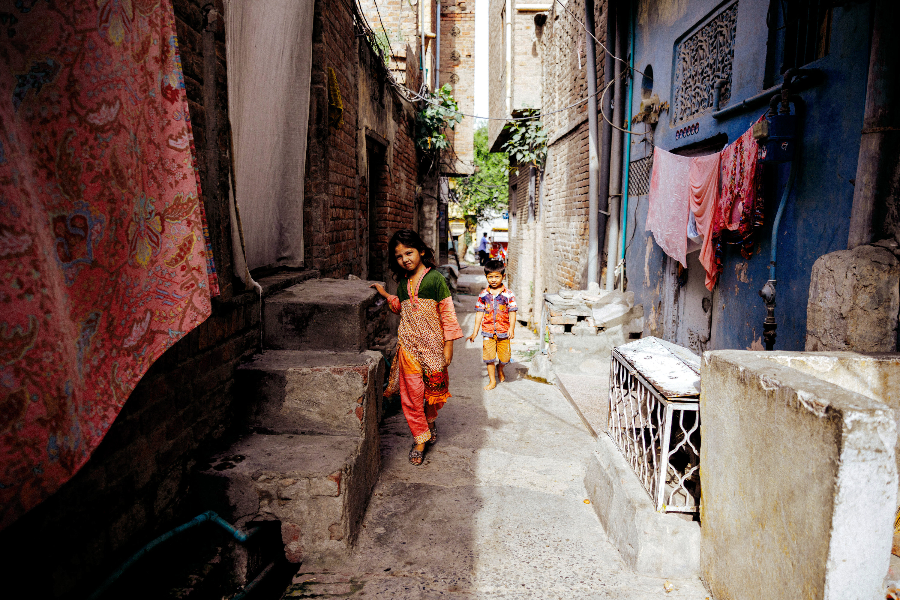
Phoblographer: Maybe it’s my laptop display, as I’m on a 2015 Macbook Pro, but how are you calibrating your monitor when you edit these Kodachrome images?
Freddie Child-Villiers: From my experience, laptops are a nightmare to keep calibrated; there are too many variables. So when retouching, I use a desktop Mac with dual monitors. My primary monitor is a ‘glossy’ Wacom Cintiq covering 99% of the Adobe RGB color spectrum, and the other is a 100% Adobe RGB accurate Dell, which is matt. Between the two, I have my bases covered for differing viewing mediums; digital, print, etc. I then use an X-Rite i1 to keep everything in check, and the room’s lighting remains consistent, which is important.
Phoblographer: Are you starting at 5200K when you edit? That’s the natural place for daylight white balance back in the day. And while you can change a lot in the printing process, the looks of slide film from a projector and displayed on a canvas are far different. I think it’s admirable that you’re doing Kodakchrome 64 first. So if that’s the case, should users be shooting at an equally lower ISO?
Freddie Child-Villiers: I set my camera between 5000K and 5500K. Living in Africa, the warmth of the light changes dramatically over the day, hence the adjustment.
However, when developing The Kodachrome Project, I had to do my best to ensure that it would work across multiple camera platforms and shooting styles. Sadly, this does affect the accuracy of any profile, which could be made more accurate if one were able to guarantee the user fix their ISO and white balance, but this expectation is a bit of a stretch.
So, if one exposes correctly with an accurate white balance, the profile should respond well, regardless of ISO – within reason.
Phoblographer: What sort of processing are you trying to emulate?
Freddie Child-Villiers: Kodachrome was in development for 75 years, and throughout its life, the film’s character evolved with the different development process’. However, fast forward to today, and current lenses (and sensors) behave quite differently from their +70-year-old counterparts. Therefore, I decided to use modern Kodachrome 64 (K-14 Process) as my baseline because I felt it impossible to emulate the older film stocks character accurately.

I began analyzing hundreds of Kodachrome scans and matching them with similar subject matter captured digitally. This proved challenging as my Kodachrome files were mainly from the US & Asia. So, I ended up sourcing imagery from people who were either living in or had visited these parts. Inadvertently, this also proved to be an excellent method for testing the profile against different cameras and shooting styles.
I then matched the tone of the digital files to the scans before studying how the film responded to color. Once I was getting consistent results where the reds, yellows, blues, etc., resembled the film’s imagery, I ‘masked out’ (put simply) the undesirable colors and tones that affect the skin or introduce a color cast. This something that makes this profile unique from anything I’ve tested.
Phoblographer: Have you studied the Kodachrome looks that people made in their everyday lives? At stoop sales, it’s easy to find tons of Kodachrome slides of vacations and all.
Freddie Child-Villiers: Unfortunately, we don’t really have things like stoop sales in South Africa. And ordering Kodachrome slides from eBay isn’t an option either; unless something is couriered – it won’t arrive. I started this project to keep me busy during the COVID-19 lockdown, so I’ve had to make do with scans.
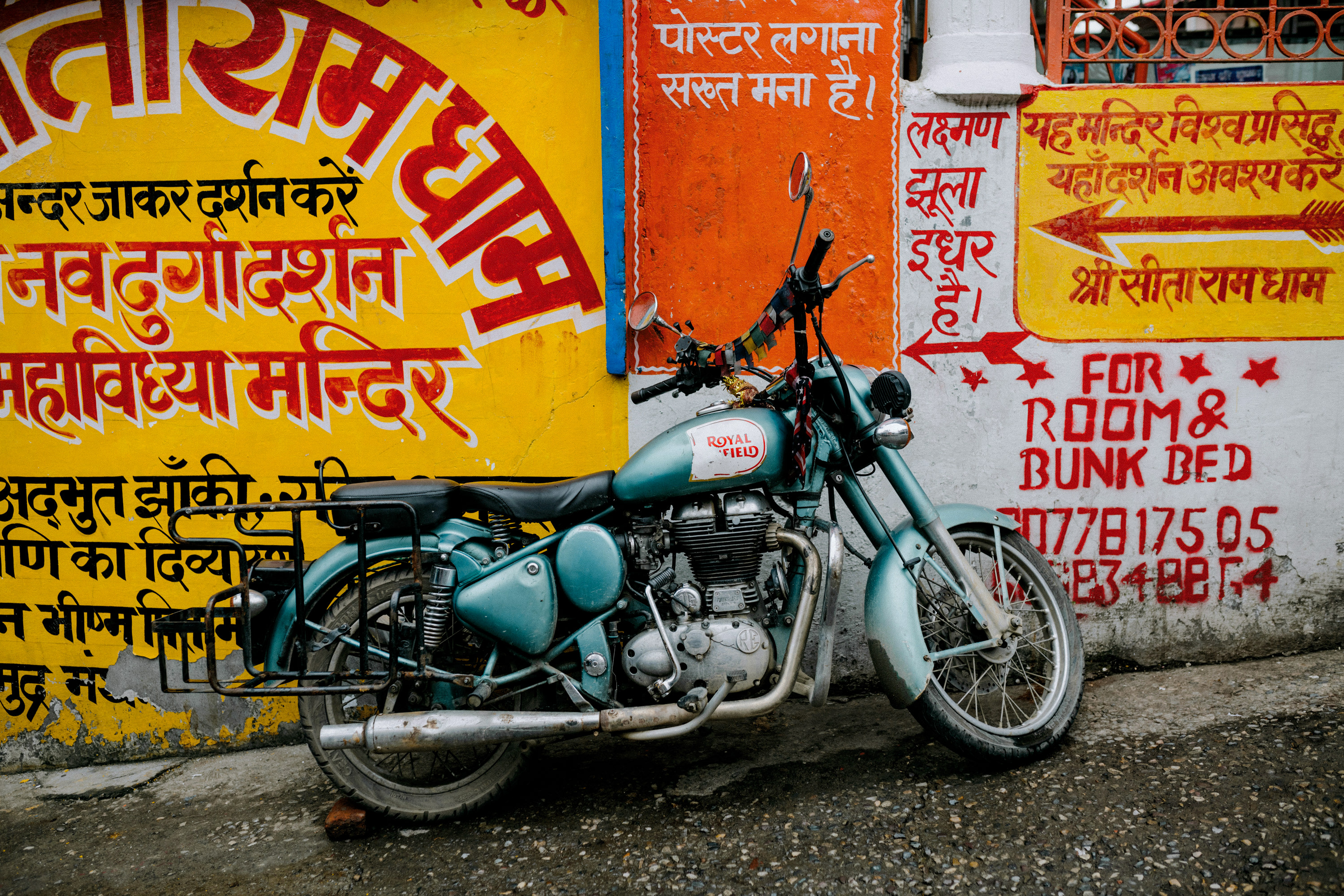
However, I’ve recently got my hands on an archive of Kodachrome slides captured locally to me. I intend to photograph these locations with my equipment and work on a profile that matches the projected slides – which tend to be warmer and not as crisp as the scans. I’ll be launching this as part of a free update available to anyone who’s purchased The Kodachrome Project.
Phoblographer: Kodakchrome wasn’t as sharp as modern-day digital above 46MP. Are you doing anything to ensure that we don’t see every single pore on someone’s face?
Freddie Child-Villiers: You’re dead on! Kodachrome 64 had less dynamic range than most modern cameras, so I must admit to taking some liberties.
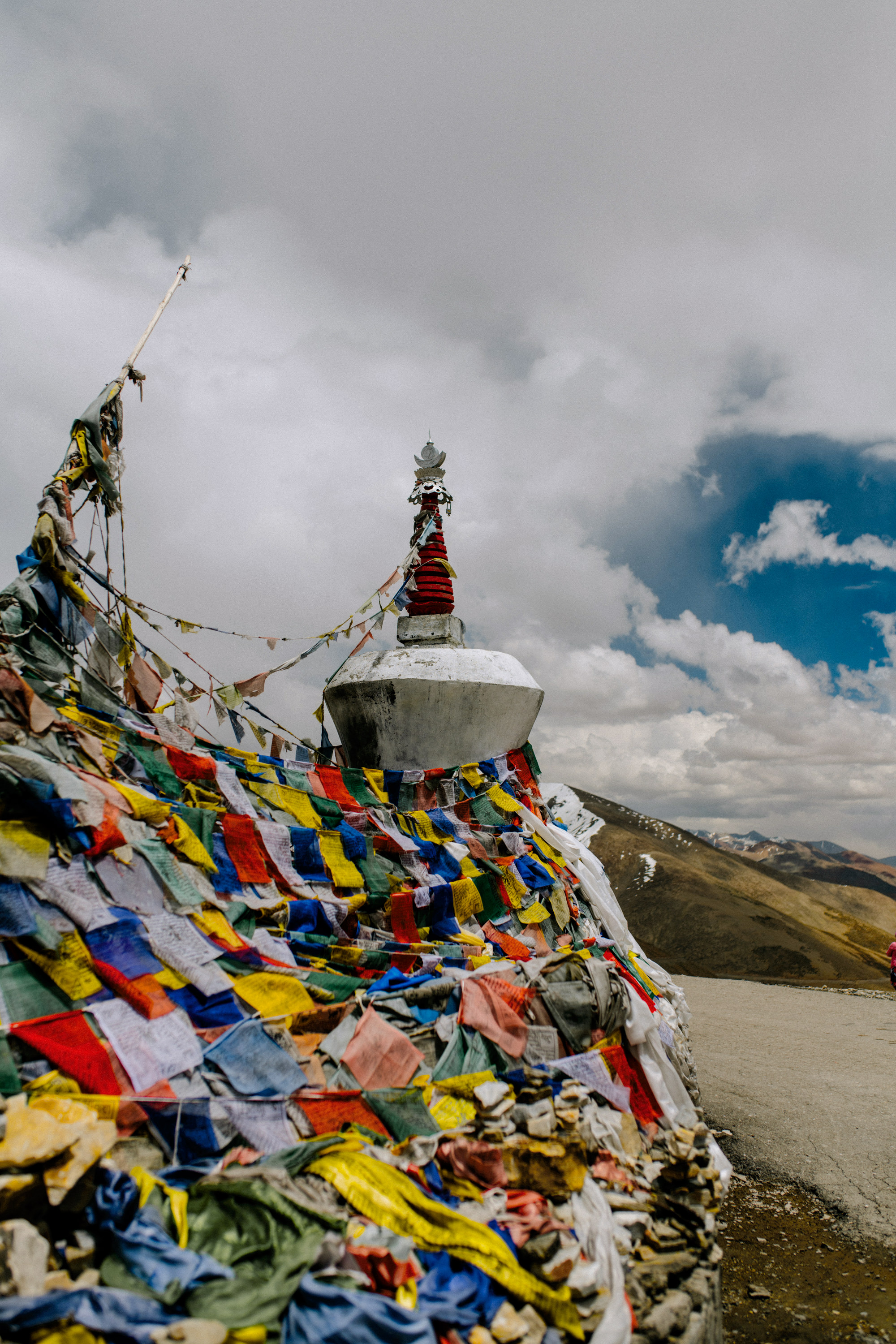
Sadly, all I have control over is color, so there isn’t much I can do to reduce the sharpness/ dynamic range within the profile without it affecting the color. So, included with the download are some basic presets which perform these tasks with a single click.
Of course, there are other options open to those who are more adventurous. I have a few customers who have sent me images using the profile with vintage Leica lenses, and they sing! Alternatively, it might be possible to get exciting results with third-party software that emulate vintage lenses. I believe NIK has software to do this for MAC/PC; alternatively, the ‘Focos’ app on mobile is sheer witchcraft.
Phoblographer: Why Lightroom? It’s apparent that Capture One’s Color Science is superior. Is it just because you want to reach the mass market?
Freddie Child-Villiers: As this is a profile, it doesn’t matter how advanced (or not) Lightroom’s color science is; it should behave the same on both.
On a personal level, I’ve been using a Hasselblad system for my commercial work for many years, which Capture One doesn’t support. I’ve also used Photoshop for my entire career, and Lightroom is an excellent cataloging/ briding tool.
Regarding the mass market, I’d love for The Kodachrome Project to do well – it’s been a lot of time and effort to get it going. However, it’s equally a passion project. I do my utmost to reach out to every customer and provide updates based on their feedback. In this regard, I view it as a communal effort. On the other hand, I have had an overwhelming number of requests for Affinity and Luminar compatibility, which I will try to provide if timing allows.

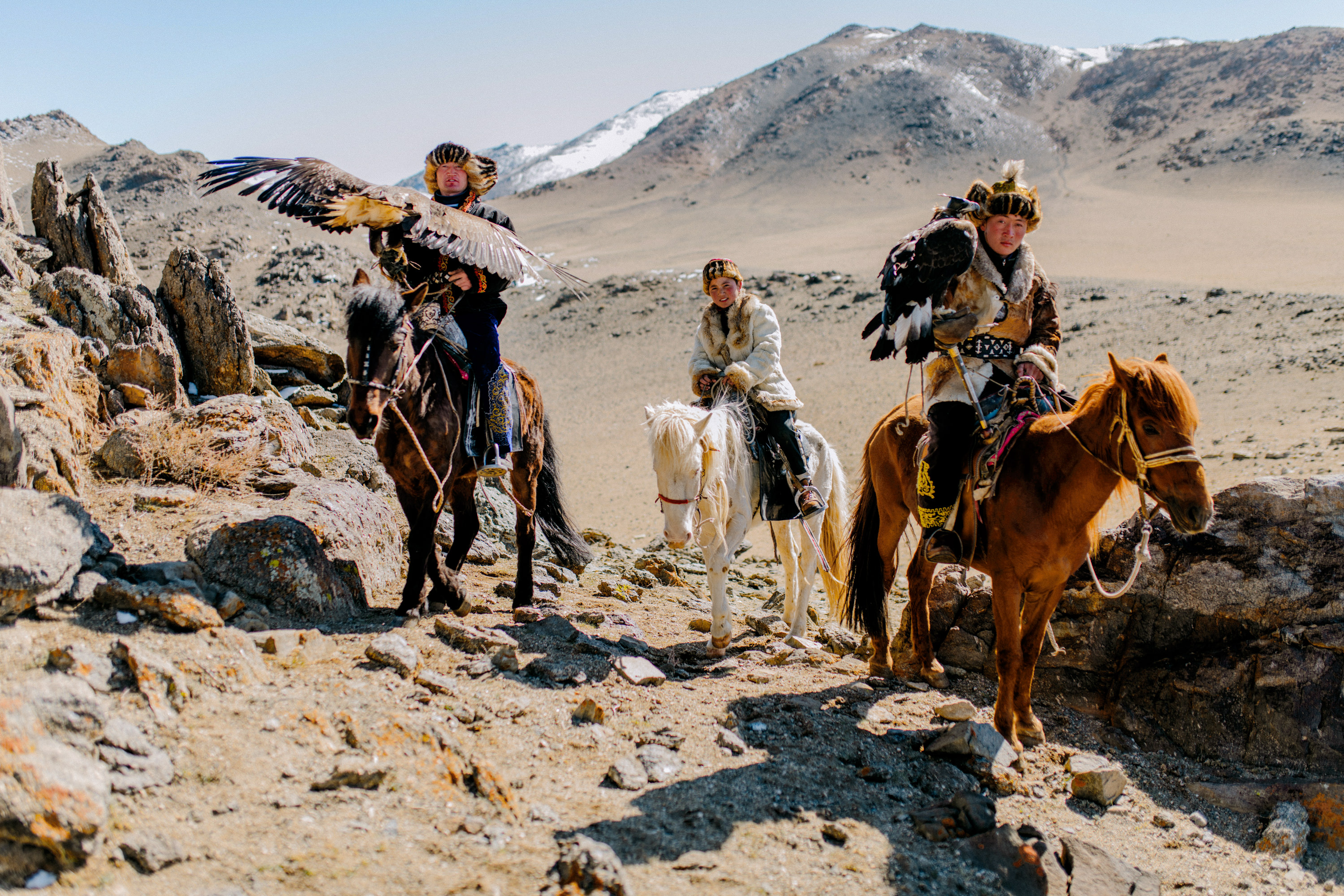
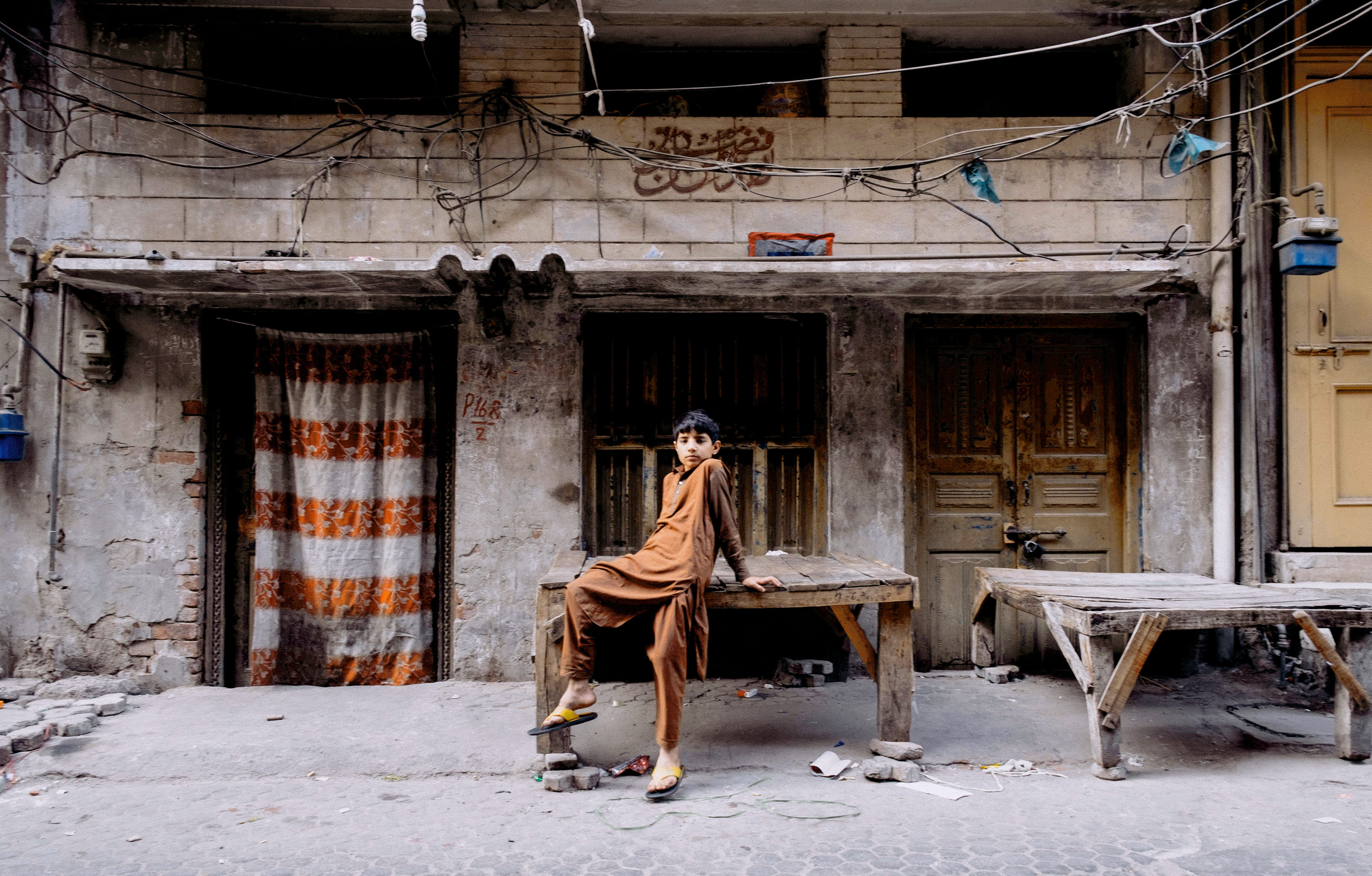
For more information, please visit Freddie’s website and the Kodachrome Project homepage. All images are by Julia Volk and A.aDil. Images are used with permission from Freddie Child-Villiers.



No comments:
Post a Comment